
Reports
Select a report to see what it shows and how to use it.
Equipment Usage
The Equipment Usage report shows how much your amenities are being used over a period you choose. Open it from the Reports screen, then use the options along the top to shape what it shows.
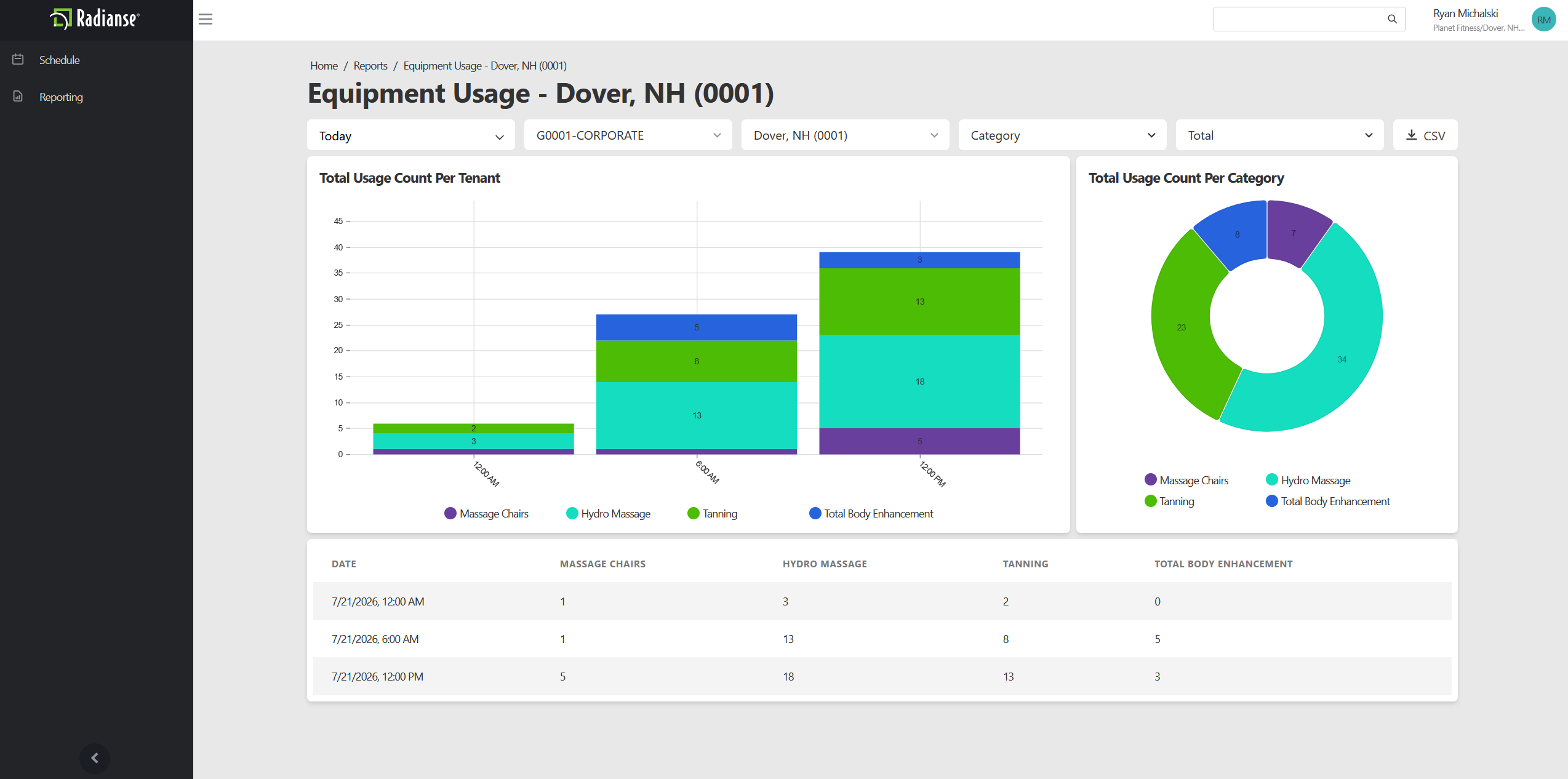
Time Range
Open the Time Range dropdown to pick a predefined period such as This Week, Last Week, or Last Month. To report on a specific window instead, set your own Start Date and End Date.
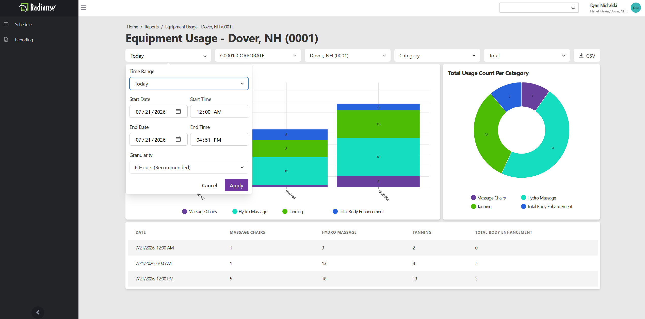
Content
The Content option sets how usage is grouped.
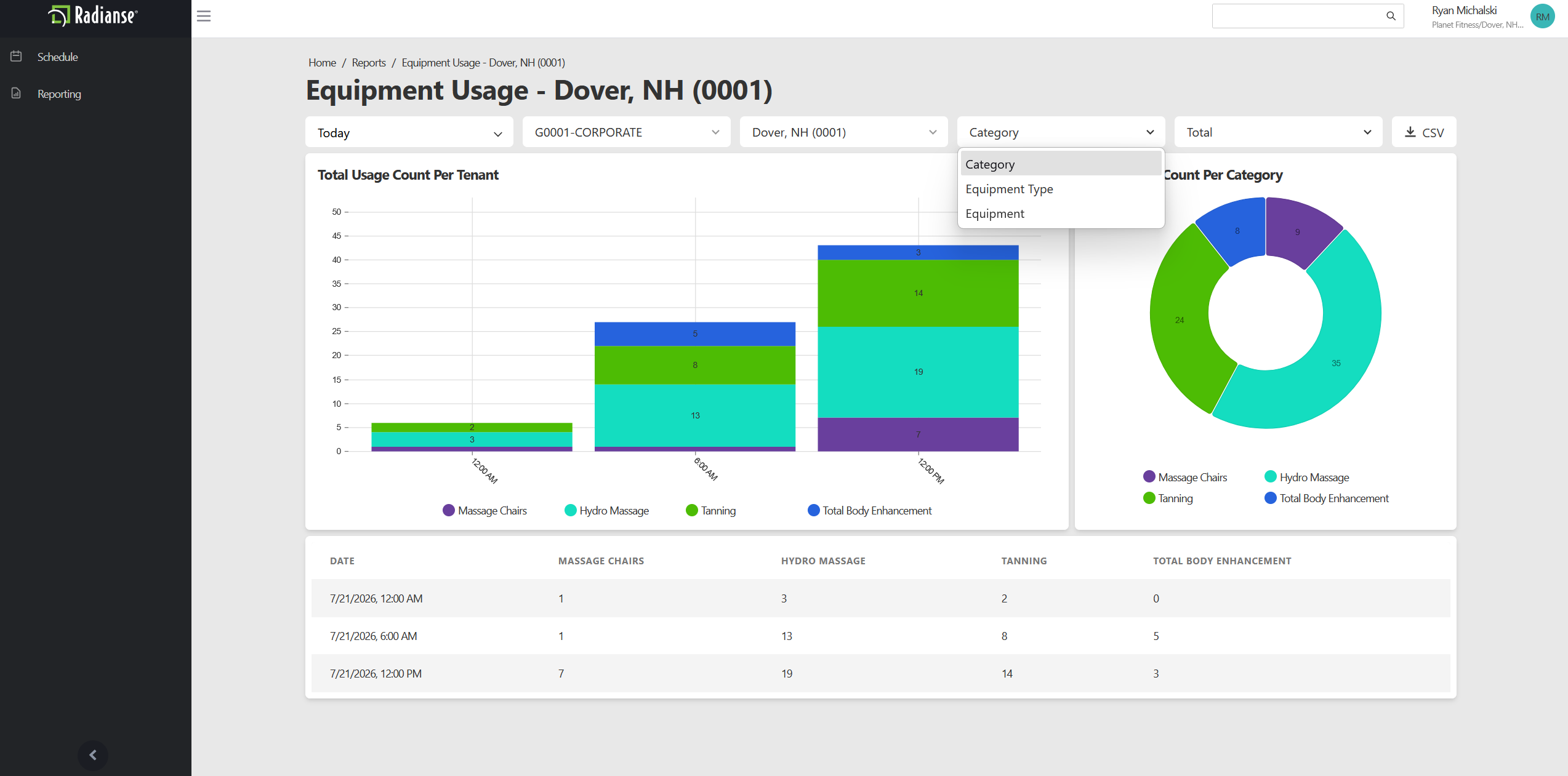
- Category (default)
- Totals for each amenity category.Example: Hydro Massage.
- Equipment Type
- Totals for each type of equipment.Example: HydroMassage Lounges, HydroMassage Beds.
- Equipment
- Totals for each individual piece of equipment.Example: HydroMassage Lounge 1, HydroMassage Bed 2.
Sum
The Sum option sets how usage is counted.
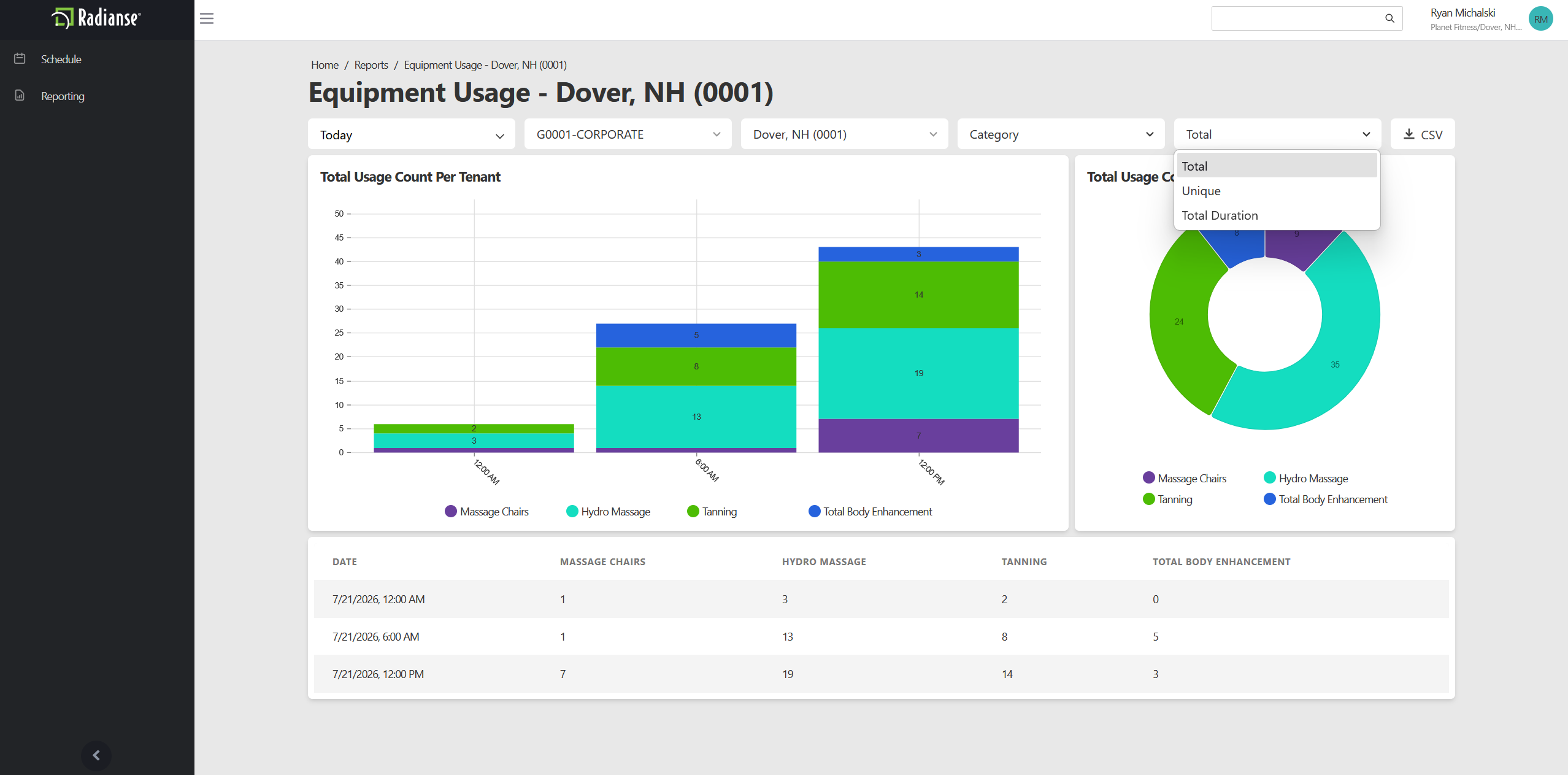
- Total (default)
- The total number of activations.
- Unique
- The number of unique activations.If a member runs two sessions back to back, it counts once.
- Total Duration
- The total time the amenities have run, shown as HH:MM:SS.
Loss Prevention
The Loss Prevention report shows when a member tried to use an amenity but did not meet a requirement, such as being Inactive or Not In Good Standing. Use it to spot patterns over time and follow up on individual members. Open it from the Reports screen, then use the options along the top to choose what it shows.
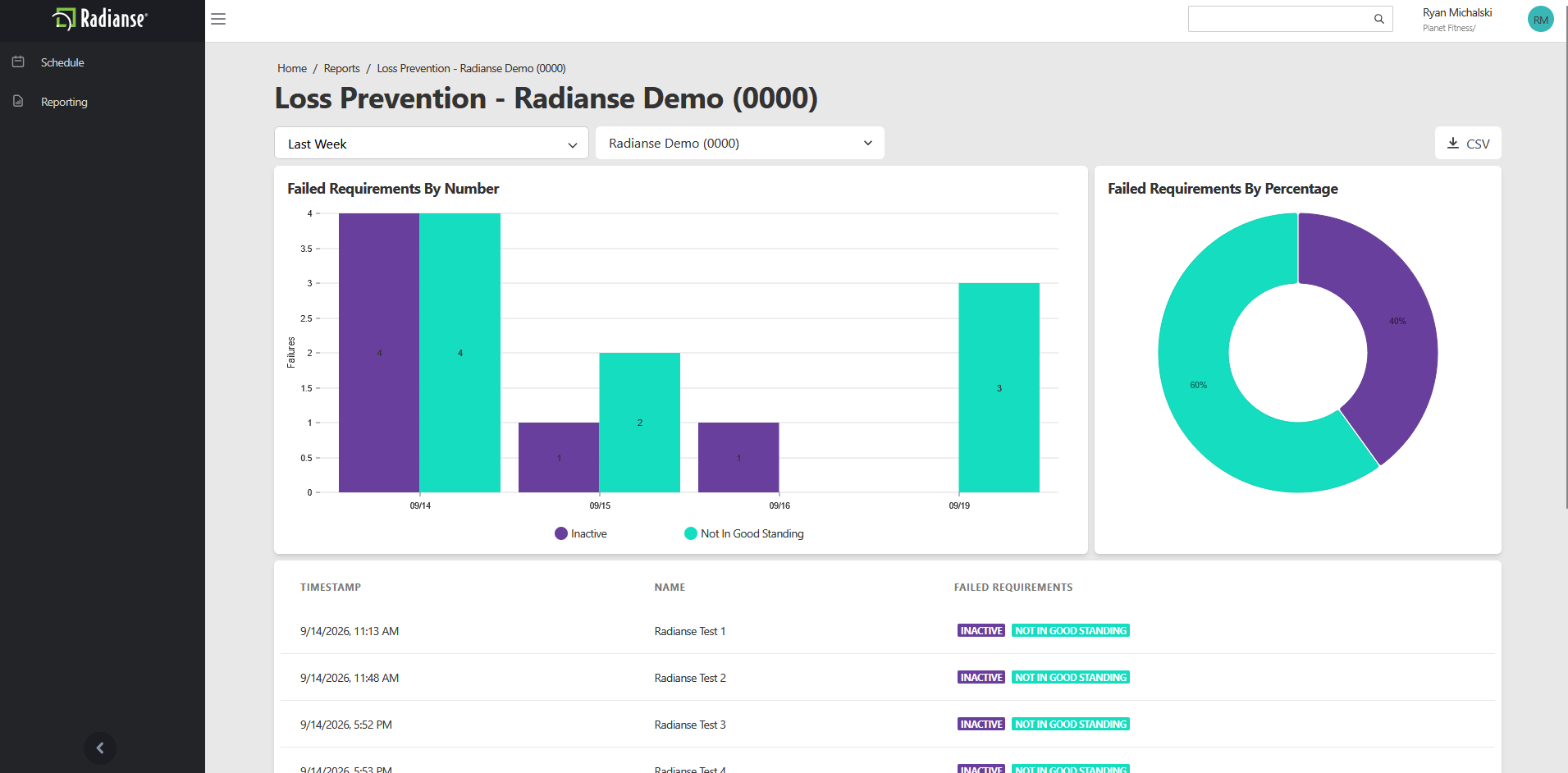
Time Range and Location
Use the Time Range dropdown on the left to pick a period such as This Week. Use the location dropdown next to it to choose which location the report covers. The location name and number also appear in the report title.
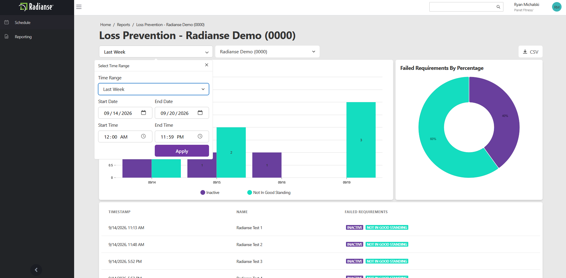
Reading The Charts
The bar chart on the left shows how many failures happened on each day in the selected period. Each bar is split by reason, and the legend below the chart identifies each color. In the example, purple is Inactive and teal is Not In Good Standing.
The donut chart on the right shows each failure reason as a share of all failures in the selected period. It uses the same colors as the bar chart, so you can see at a glance which reason is most common.
Failure Details Table
The table below the charts lists each failure individually.
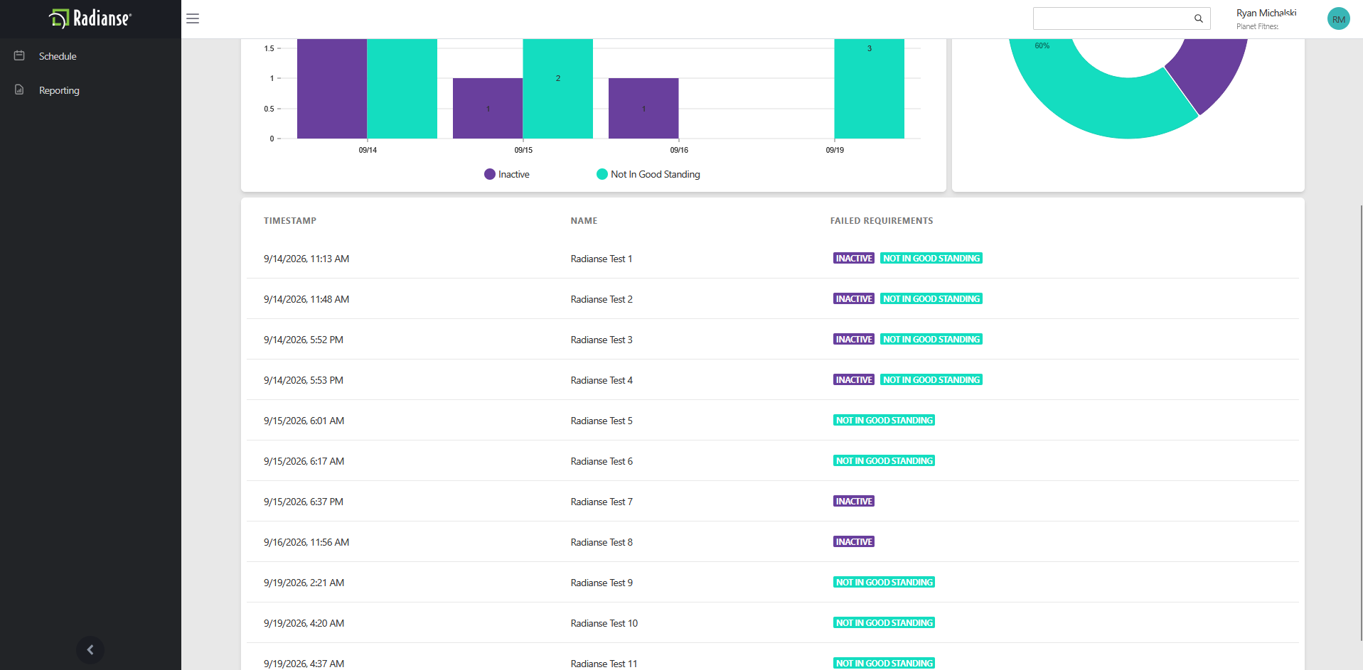
- Timestamp
- The date and time the failure occurred.
- Name
- The name of the member who did not meet the requirement.
- Failed Requirements
- The reason the requirement was not met.Example: Not In Good Standing, Inactive.
CSV
Select the CSV button at the top right of the report to download the data as a CSV file.
Maintenance History
The Maintenance History report is a log of maintenance activity on your equipment. Use it to see when equipment was serviced, who recorded it, and what was noted. Open it from the Reports screen, then choose a time period.
Time Range
Open the Time Range dropdown at the top right to pick the period the report covers, such as Last Week.
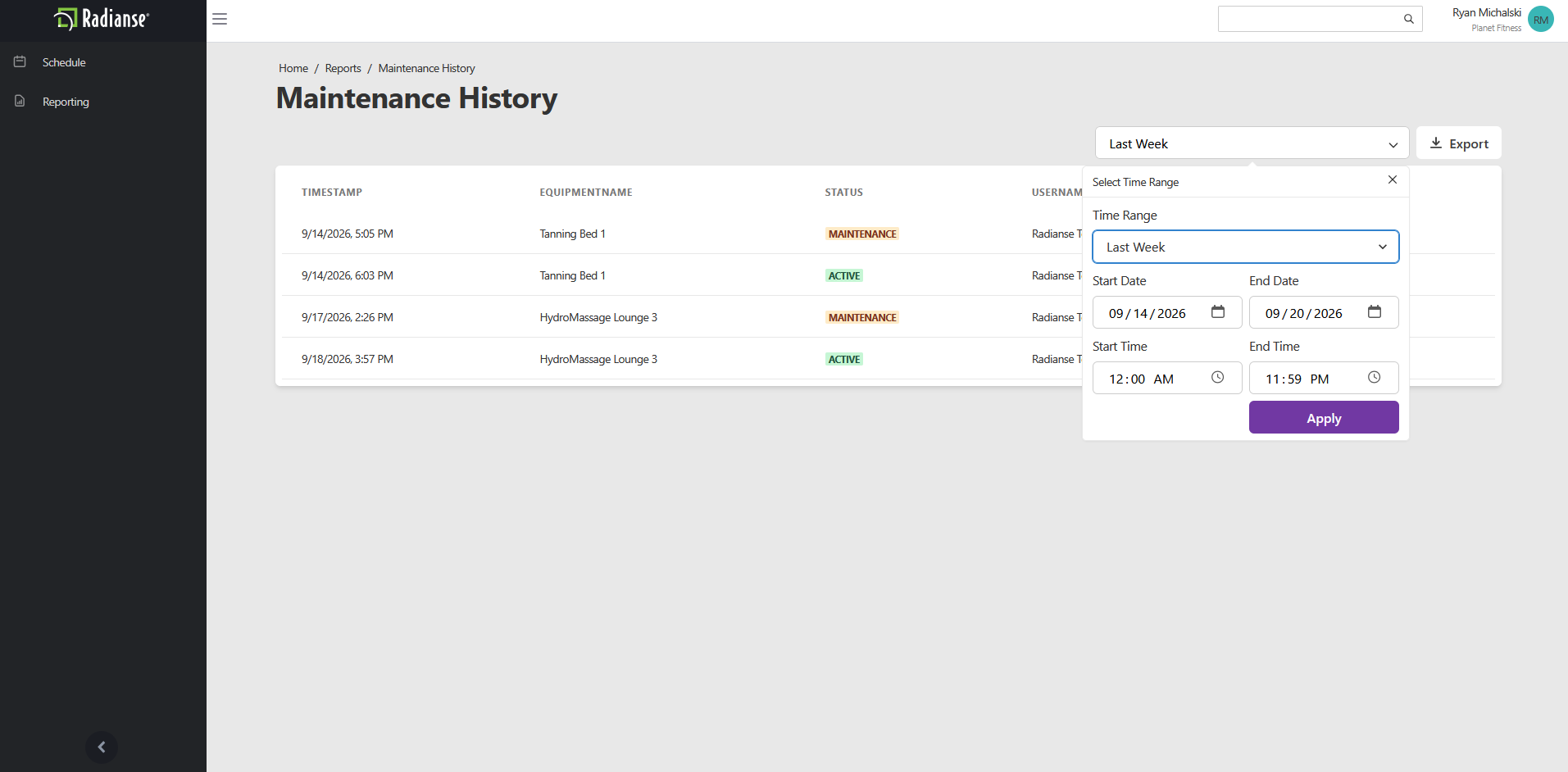
Maintenance Log
Each row in the table is one maintenance entry.
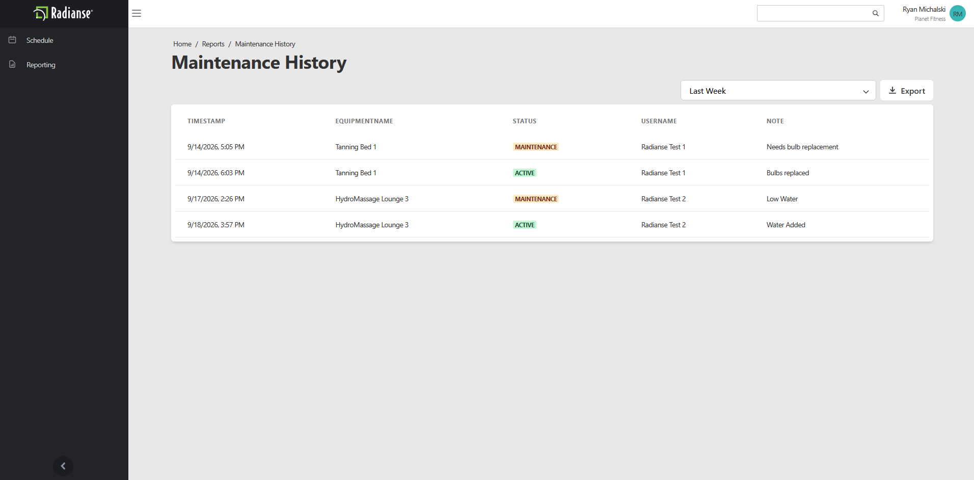
- Timestamp
- The date and time the entry was recorded.
- Equipment Name
- The piece of equipment the entry applies to.Example: Tanning Booth 6.
- Status
- The status of the equipment after the entry was recorded.Example: Active.
- Username
- The user who recorded the entry.
- Note
- The note entered with the maintenance update.Example: Equipment repaired.
Export
Select the Export button at the top right of the report to download the data.
Red Screens
The Red Screens report shows every time a member was stopped from using an amenity because of an error, or red screen. Use it to see how often each type of error happens and which members are affected. Open it from the Reports screen, then use the options along the top to choose what it shows.
Time Range and Location
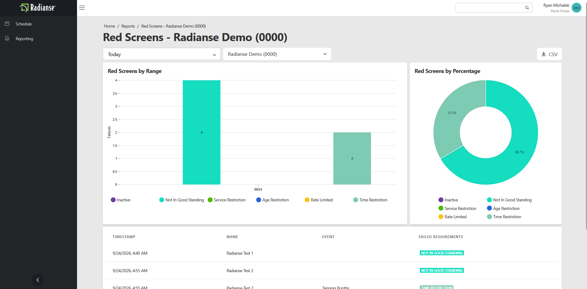
Use the Time Range dropdown on the left to pick a period such as Today. Use the location dropdown next to it to choose which location the report covers. The location name and number also appear in the report title.
Red Screens by Range
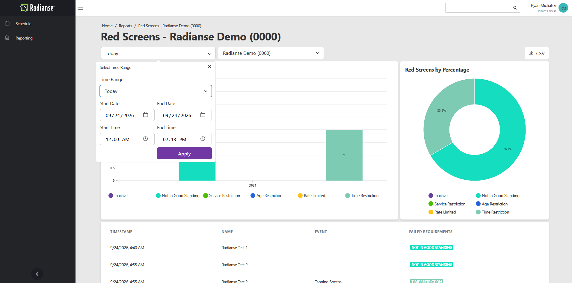
The bar chart on the left shows how many red screens happened in the selected period. Each bar is split by error category, and the legend below the chart identifies each color.
- Inactive
- The member’s account is inactive.
- Not In Good Standing
- The member’s account is not in good standing.
- Service Restriction
- The member is restricted from using that service.
- Age Restriction
- The member did not meet the age requirement.
- Rate Limited
- The member reached the limit on how often they can use the amenity.
- Time Restriction
- The member tried to use the amenity outside the allowed time.
Red Screens by Percentage
The donut chart on the right shows each error category as a share of all red screens in the selected period. It uses the same colors as the bar chart, so you can quickly see which error is most common.
Red Screen Details Table
The table below the charts lists each red screen individually.
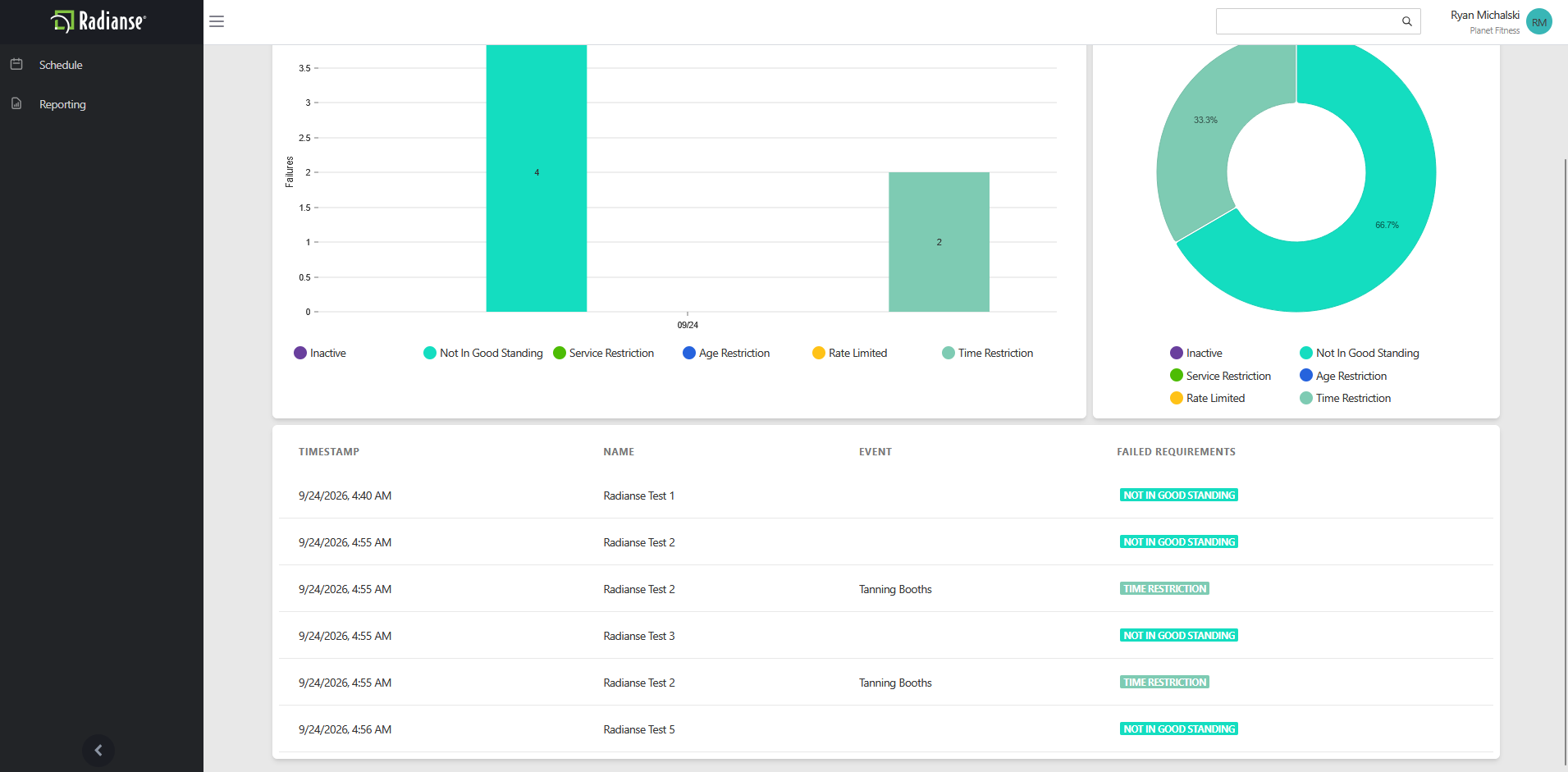
- Timestamp
- The date and time the red screen occurred.
- Name
- The name of the member who received the red screen.
- Event
- The type of amenity the member was trying to use, when one applies.Example: Tanning Booths.
- Failed Requirements
- The error category that caused the red screen.Example: Not In Good Standing, Time Restriction.
CSV
Select the CSV button at the top right of the report to download the data as a CSV file.
Schedule History
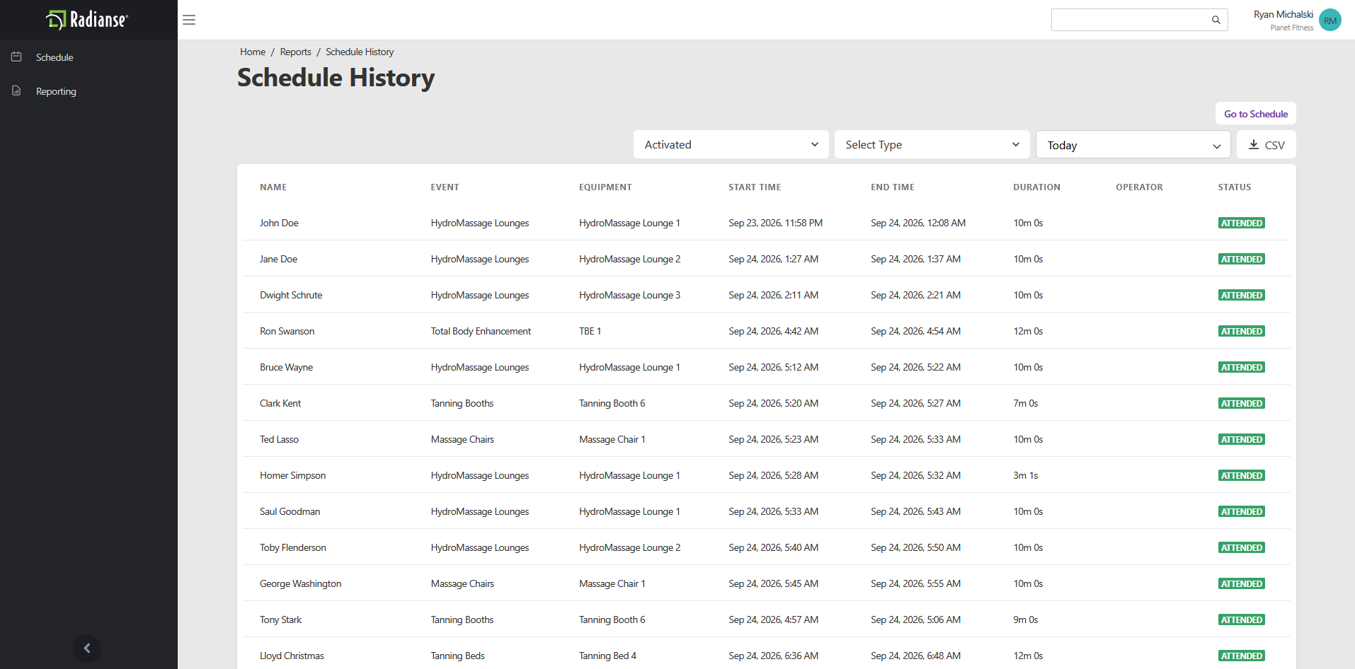
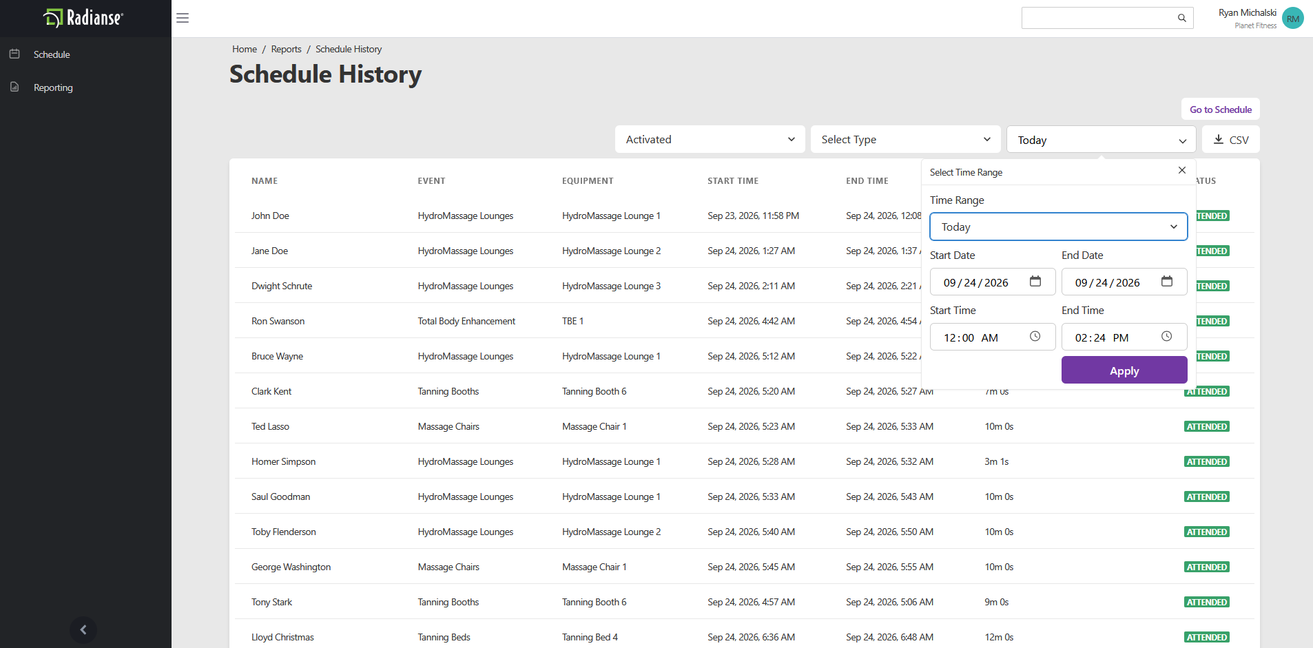
The Schedule History report is a record of activity on your equipment. It lists who used each piece of equipment, when they started and finished, and how long they were on it. Open it from the Reports screen, then use the filters along the top to narrow what it shows.
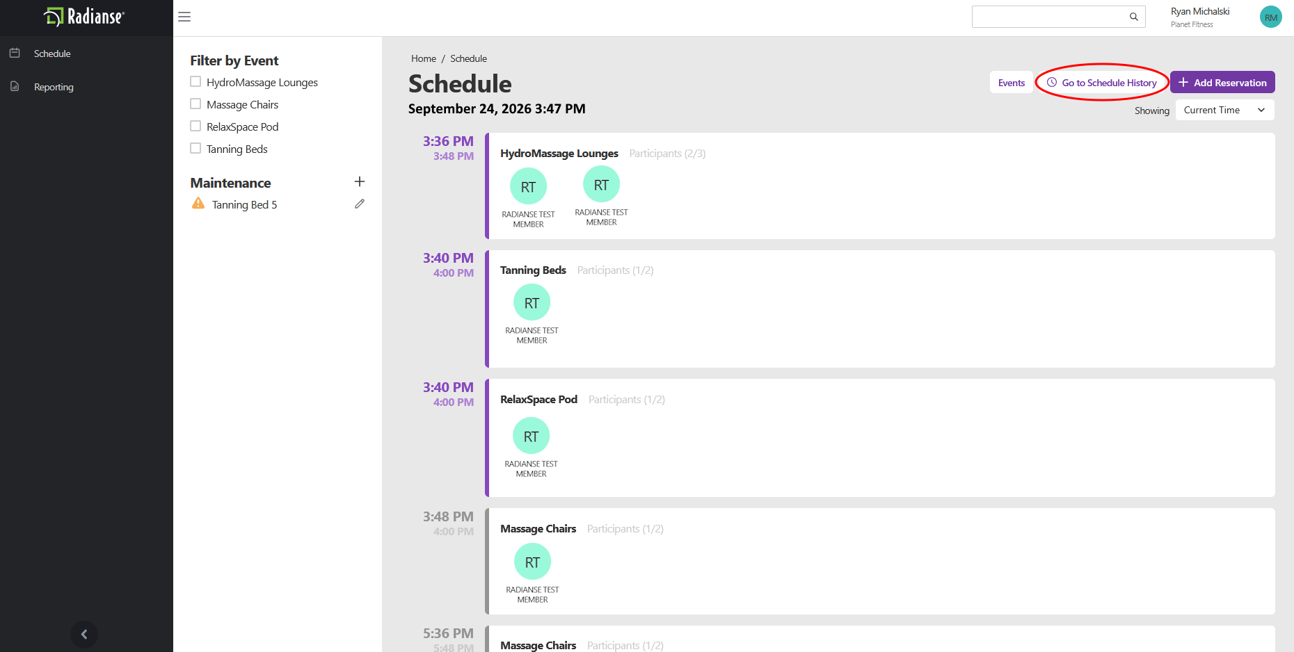
Opening from the Schedule Tab
You can also open this report from the Schedule tab. Select Go to Schedule History in the top right corner of the Schedule screen.
Schedule Type Filters
The first dropdown filters the list by the status of each schedule entry. It is set to Activated in the example.
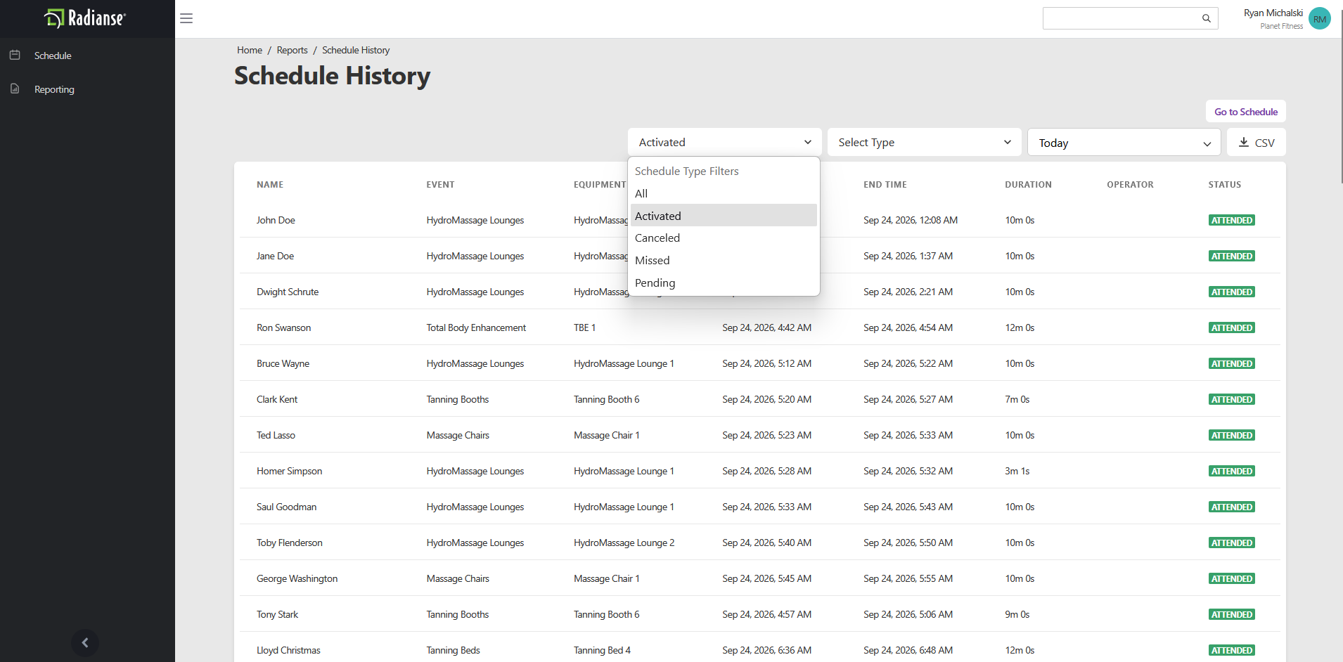
- All
- Every schedule entry, regardless of status.
- Activated
- Entries that were activated.
- Canceled
- Entries that were canceled.
- Missed
- Entries that were missed.
- Pending
- Entries that are still pending.
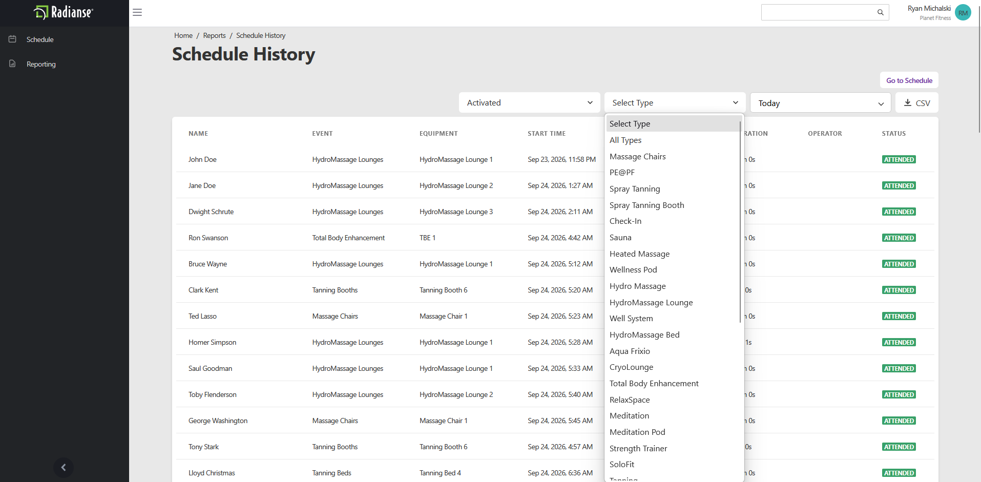
Select Type
The Select Type dropdown filters the list by amenity type, so you can view only the equipment you care about, such as Tanning Booths or Massage Chairs.
Time Range
Open the Time Range dropdown to pick a predefined period such as Today. It works the same way as in the other reports.
Schedule History Table
Each row in the table is one schedule entry.
- Name
- The name of the member.
- Event
- The type of amenity used.Example: HydroMassage Lounges, Tanning Booths.
- Equipment
- The individual piece of equipment used.Example: HydroMassage Lounge 1, Tanning Booth 6.
- Start Time
- The date and time the member started on the equipment.
- End Time
- The date and time the member finished.
- Duration
- How long the member was on the equipment.
- Operator
- The operator associated with the entry, when there is one.
- Status
- The status of the entry.Example: Attended.
CSV
Select the CSV button at the top right of the report to download the data as a CSV file.
Unique Usage History
The Unique Usage History report shows how many different people used each amenity category during a period you choose. Unlike the other usage counts, it counts each person once per amenity. If the same member uses Hydro Massage three times in a day, it shows as 1. Open it from the Reports screen, then choose a time range.
Time Range
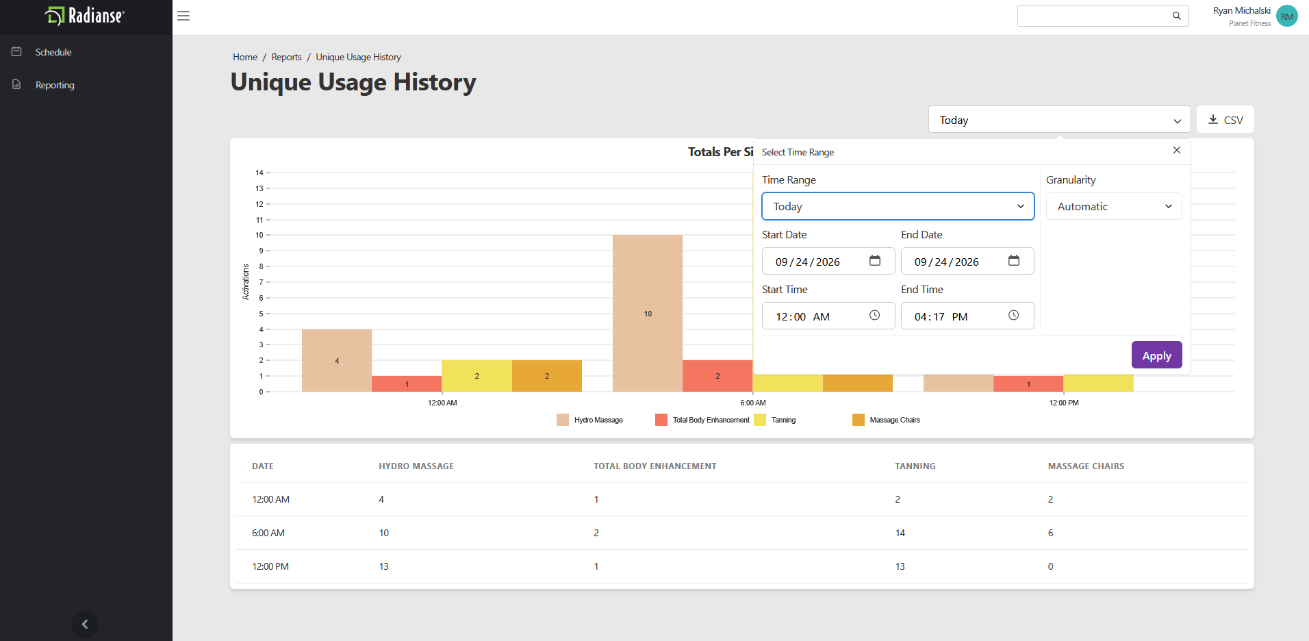
Open the Time Range dropdown at the top right to pick a predefined period such as Today. You can also change the granularity of the data in this dropdown.
Totals Per Six Hours
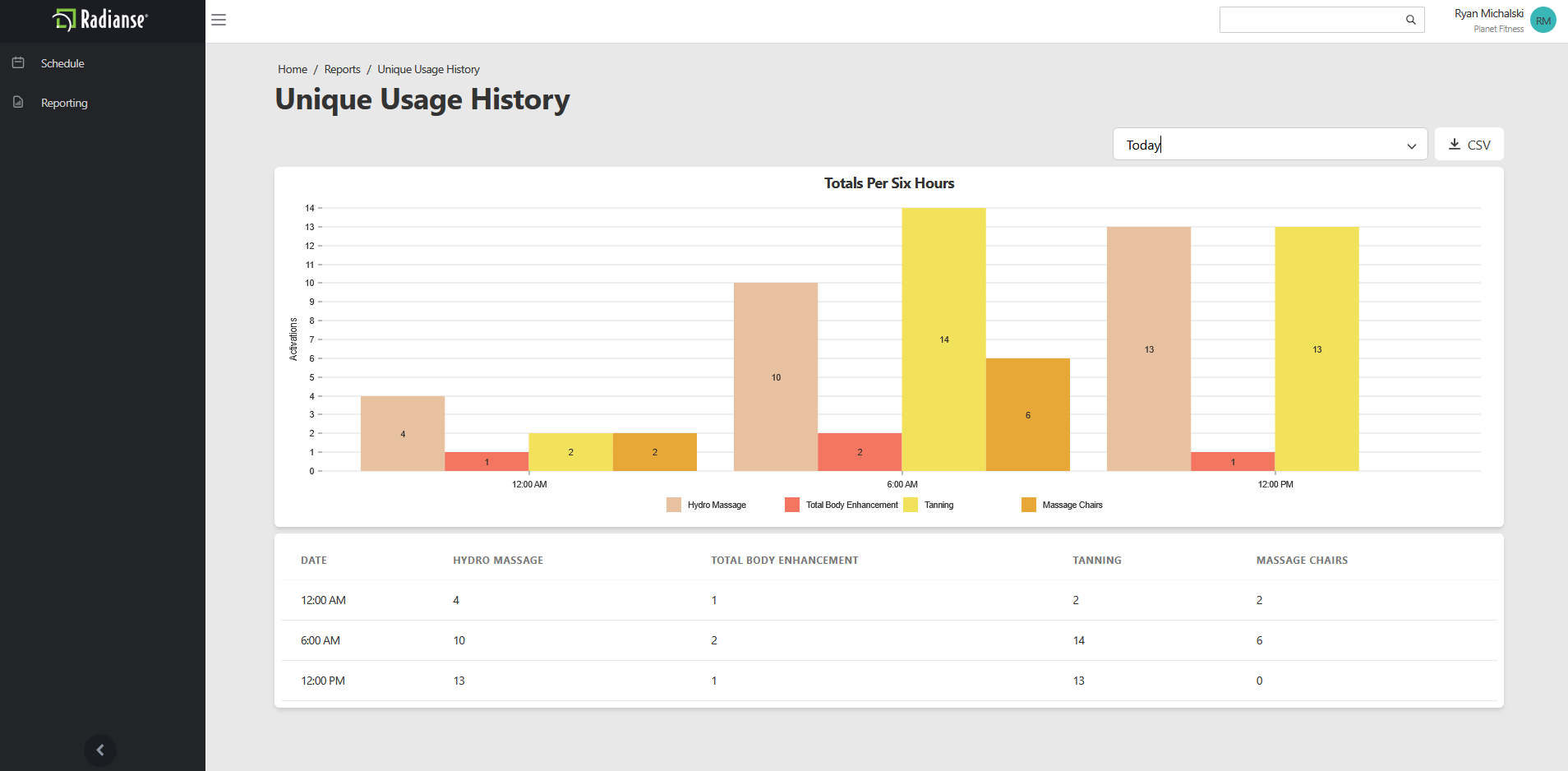
The bar chart at the top breaks the selected period into six-hour blocks. Each block shows one bar per amenity category, and the legend below the chart identifies each color. The height of a bar is the number of unique people who used that category in that block.
Usage Table
The table below the chart shows the same numbers, as in the screenshot above. Each row is a six-hour block, and each column is an amenity category.
- Date
- The start of the six-hour block.Example: 12:00 AM, 6:00 AM, 12:00 PM.
- Amenity category columns
- The number of unique people who used each category in that block.Example: Hydro Massage, Total Body Enhancement, Tanning, Massage Chairs.
CSV
Select the CSV button at the top right of the report to download the data as a CSV file.